
01
Bring Program, Diary, and Discover into one schedule.
Design responseConnected schedule
Program, Diary, and Discover activities share one schedule.
Mobile health & fitness
Olive
I used research and usability testing to connect Program, Discover, Reminder, Activity, and Diary into one mobile experience.
Plan or discover
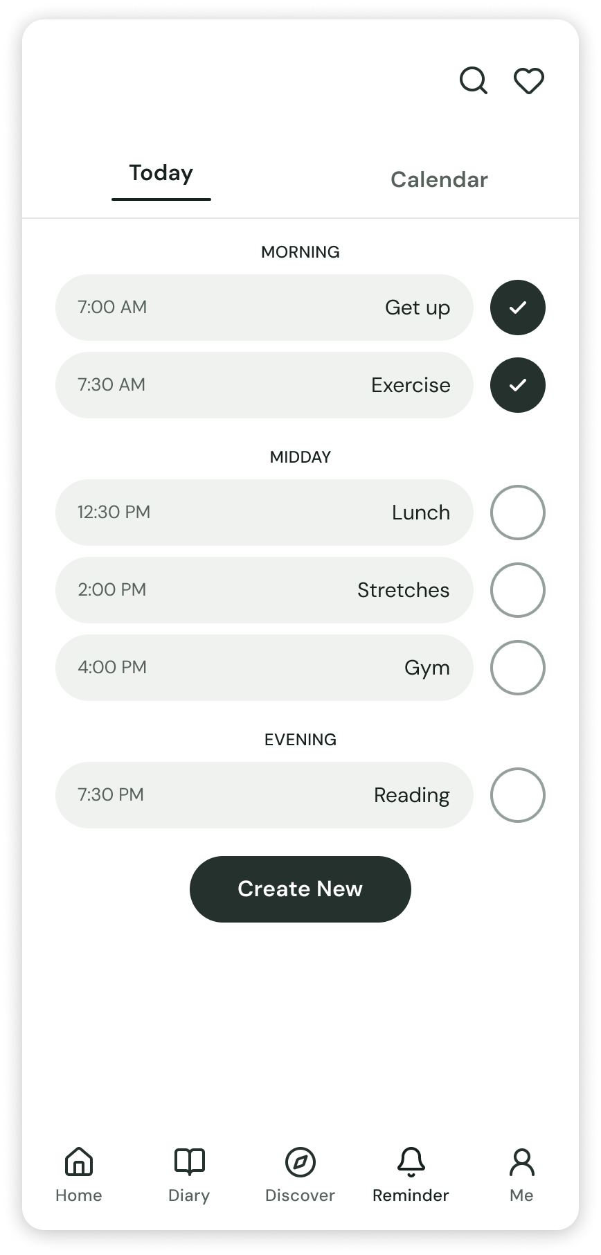
Start with a clear program, the next workout, and quick actions for the day.
Reminder
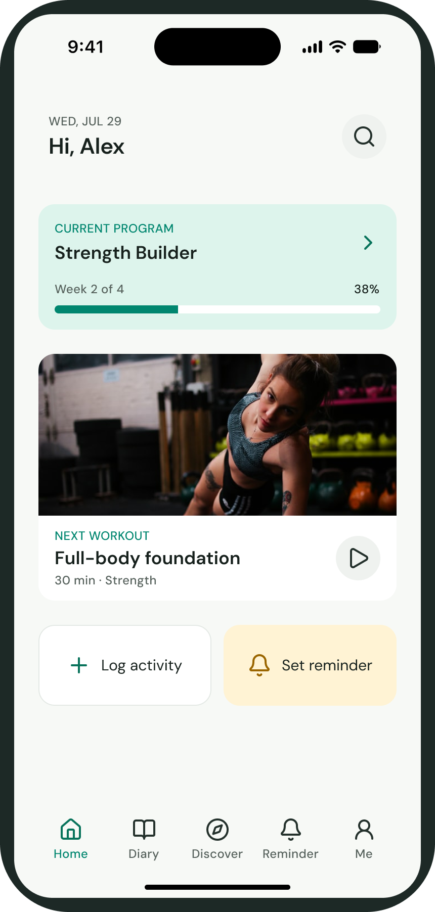
Bring program, Diary, and Discover activities into one visible daily schedule.
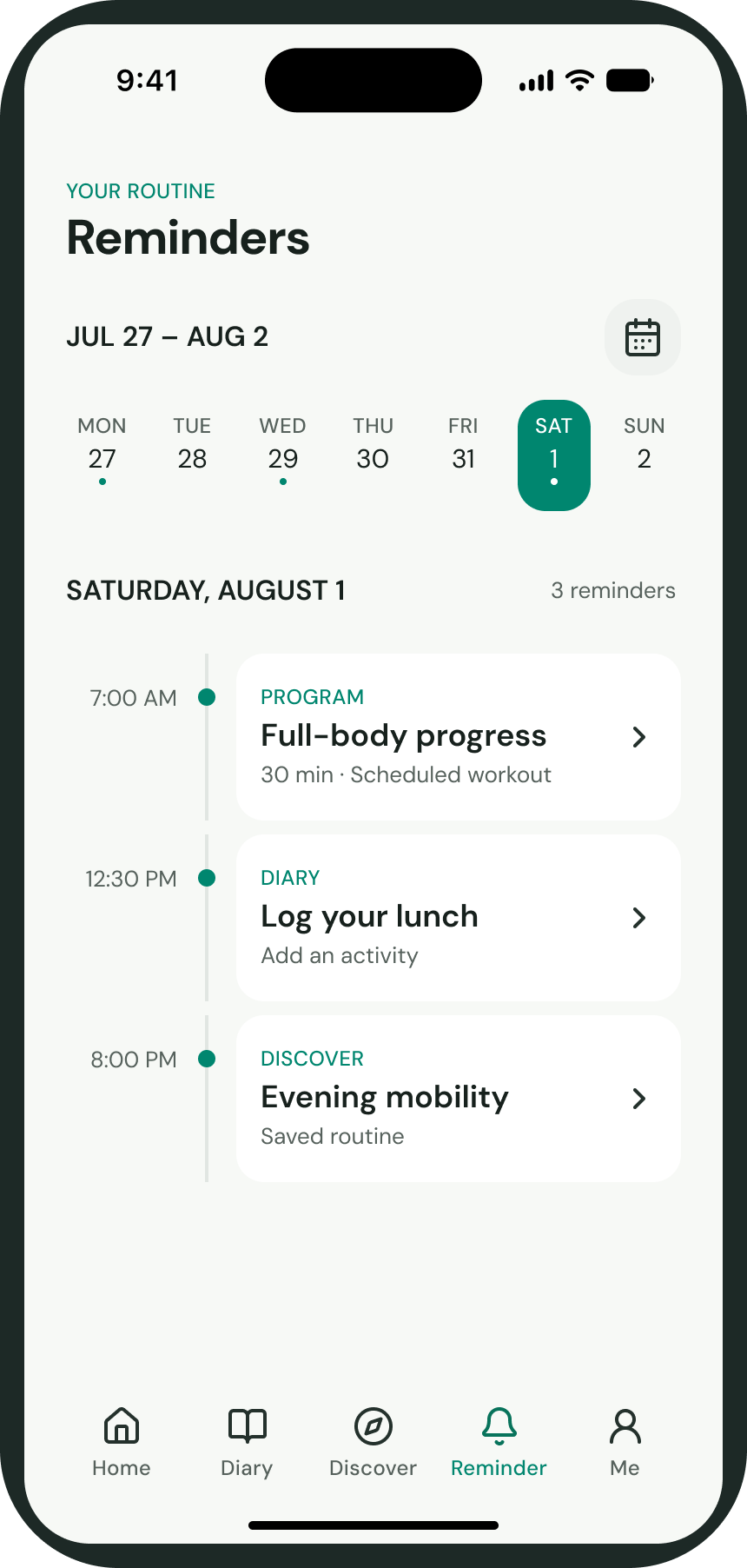
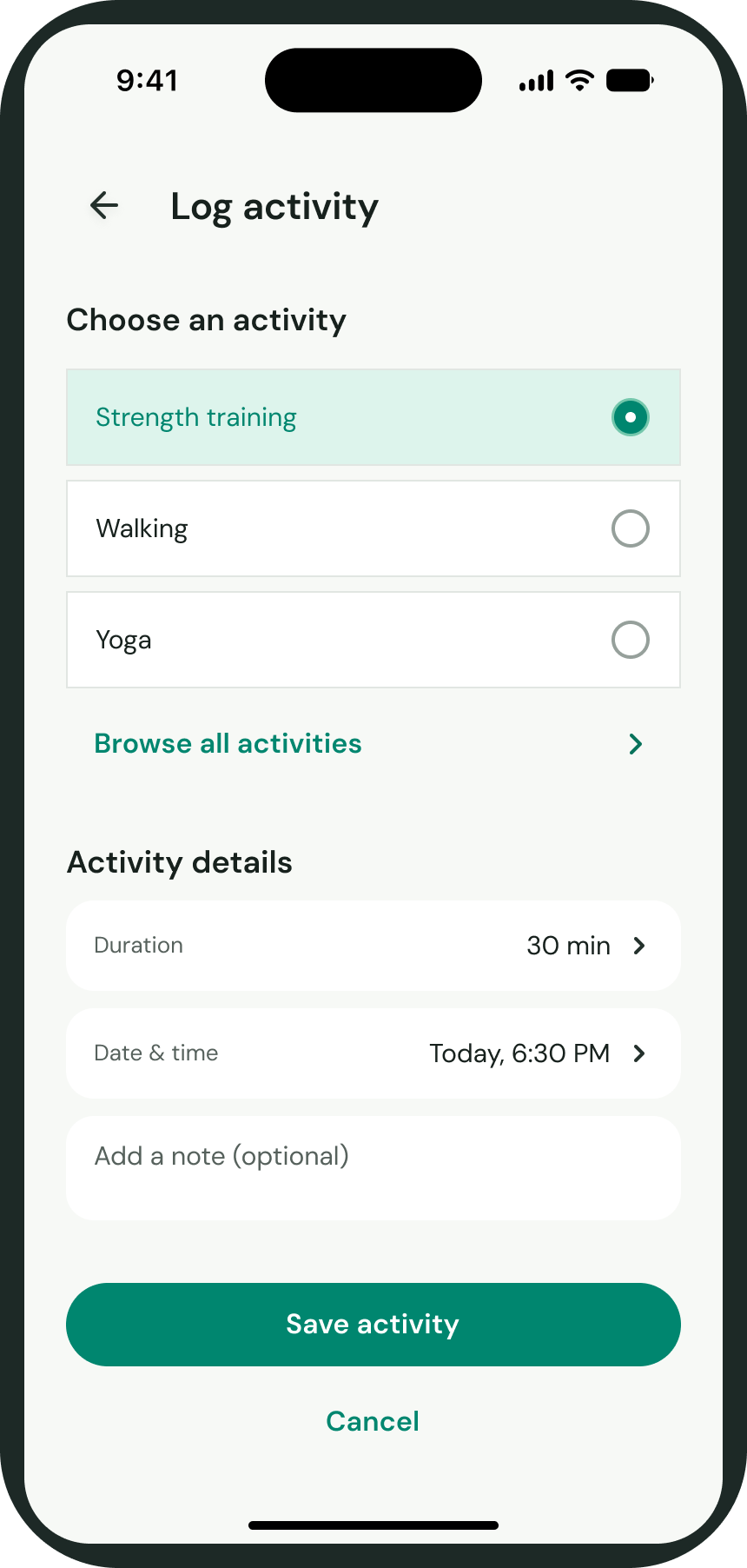
Activity
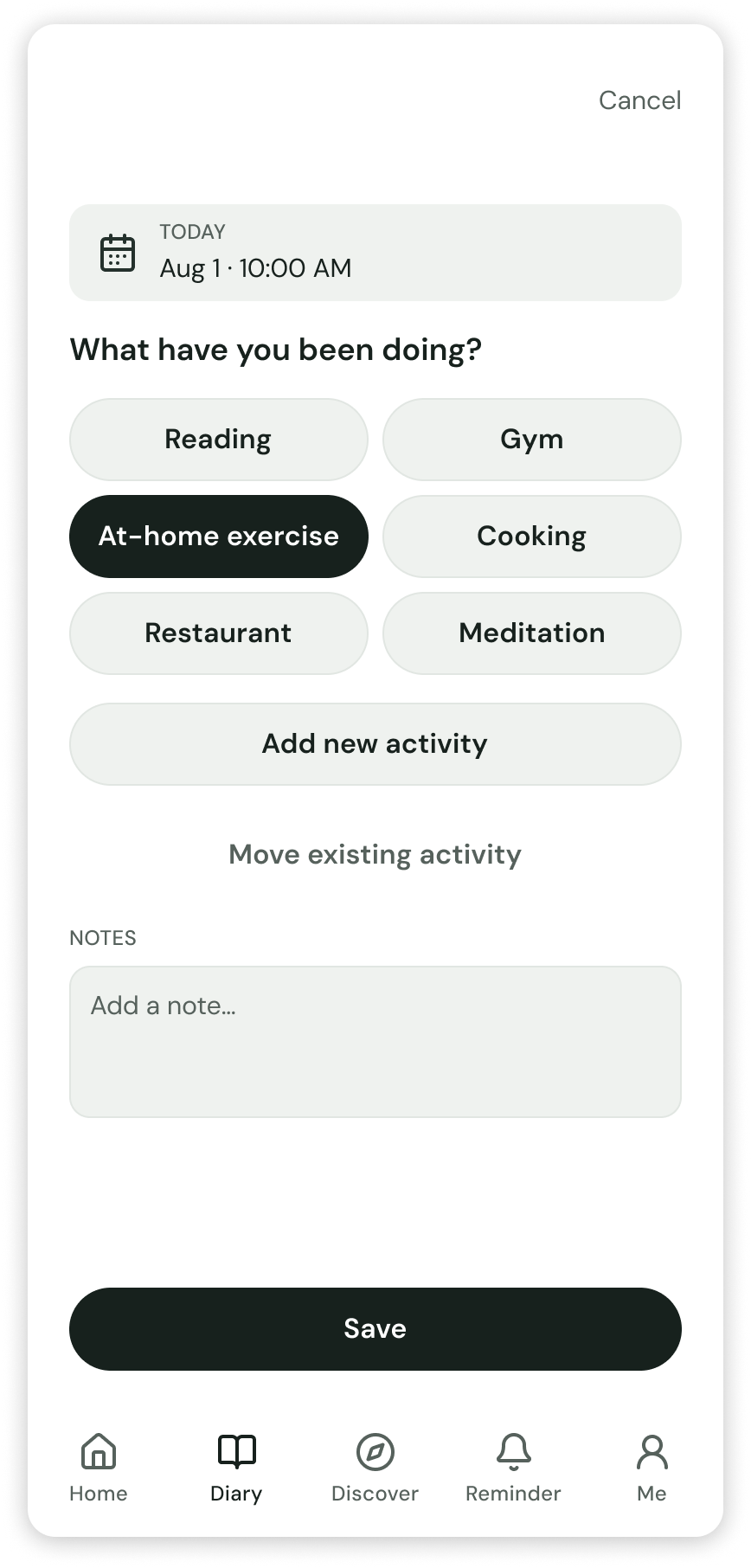
Choose an activity, add the useful details, and save it without scanning a wall of options.
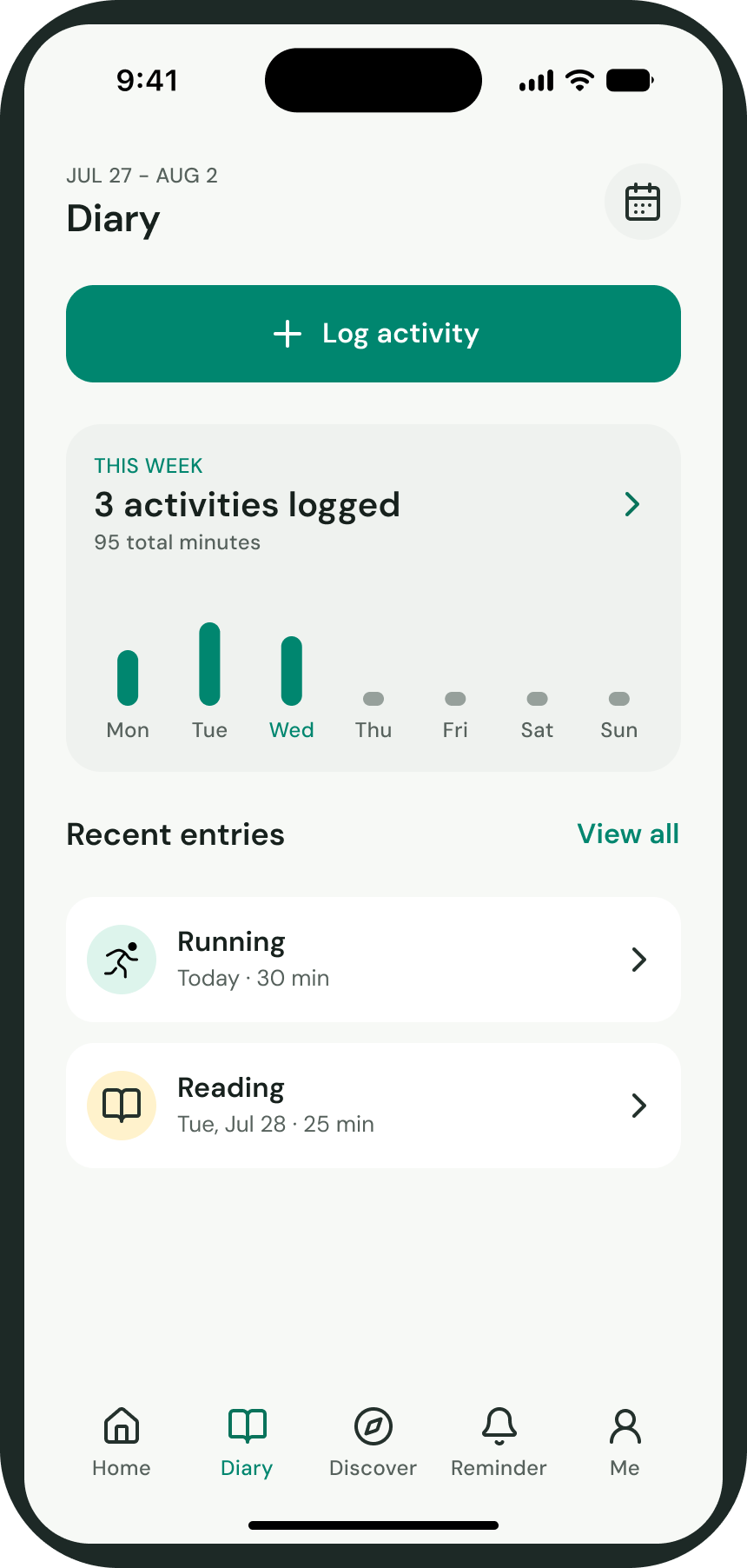
Diary
Keep a simple record of completed activities so progress remains visible over time.
After choosing a plan, users can review its workouts, save reminder timing, and return Home with the current program already in place.
Each was useful on its own, but together they did not yet behave like one experience. The design question was how to connect discovery, scheduling, completion, and recording without making each feature feel like a separate task.
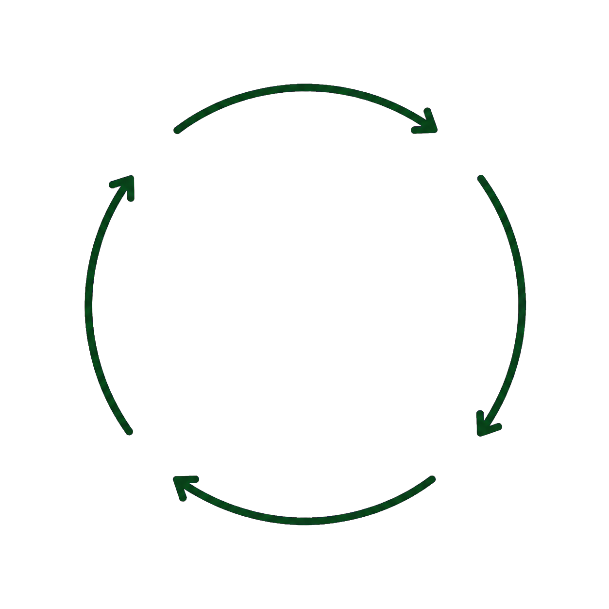
That question led me to organize Olive around one repeated loop: plan or discover an activity, place it into the day, complete it, and keep a record. This model guided the design decisions that follow.
Program, Diary, and Discover activities share one schedule.
Participants had trouble finding the right activity among many buttons.
Discover: I combined separate workout and article collections into one continuous feed.
Working end to end showed me that research, structure, interaction, and visual design cannot be separated. Each decision changes what needs to be tested next.
Feedback from participants directly reshaped the schedule, activity logging, and Discover experience. It taught me to test connections between features early and use evidence to guide the next design decision.